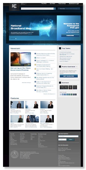
FCC Test Drives New Website Design
06 04, 11 09:37 Filed in: FCC website
Yesterday FCC rolled out for a “test drive” a beta version of its new website design, shown at left. Readers will recall that criticism of the current design has been a recurring theme here. Basically it is both disorganized and cluttered. There is lots of information, but few can find it. FCC was an early leader in agency websites, but the current design dates to the Hundt era.
It is unclear whether the new website addresses a major problem of the old website: nobody was really in charge and lots of people could clutter the “prime real estate” of the home page with their pet projects and announcements. Presently, it has a new type of clutter - 6 videos of bureau chiefs talking on their favorite topics. One wonders if all 5 commissioners will demand equal time?
Another observation is that the new design still takes more than 2 screens to display the whole vertical height. Now Whitehouse.gov also needs 2 screens, but a lot of agencies like the previously discussed FERC are able to organize their whole complex mission into 1 screen full.
The FCC explained the philosophy of the new design in a press release. The Commission also welcomes comments on the new design.
blog comments powered by Disqus


![Validate my RSS feed [Valid RSS]](valid-rss-rogers.png)

